
I frequently cite, and sometimes am forced to chide, a prolific and detailed observer of data from the streaming world who goes by the psuedonym THE ENTERTAINMENT STRATEGY GUY. What I know about him is that he was a veteran of a couple of platforms and spent an awful lot of time parsing data from just about every possible source he could get his hands on. Including, when employed, the proprietary metrics and KPIs that most of us who somehow weren’t seen as a “fit” for one of those sexy companies long to get our mitts on.
 And no, the bi-annual Netflix global data dump isn’t the be-all and end-all, no matter how excited those that purport to have the same skill sets as “ESG” get when they receive that present, which if seasonality is a precedence means we are likely due for another 20.000-ish-row Excel spreadsheet sometime in the next few days. To his credit, ESG utilizes that as only one of the tools in his utility belt.
My particular issue, and I admit it’s a niggly one, is that ESG insists on using just about EVERY metric available from any third party as part of his exhaustive analyses of how streaming content performs, including a few that I’ve been a client of and am well aware have some flaws. His approach seems to be since there’s no outright consensus out there among anyone, and that the individual streamers tend to use as little more than secondary information, he will provide exceptionally dense line graphs reflecting this gamut, which to me produces an overwhelming and confusing pictorial that reinforces their inconclusivity. I suspect that democratic approach tends to appease those with a particular preference, but it doesn’t make it any easier for more global observers to come to definitive conclusions.
That particular irk of mine notwithstanding, ol’ ESG did release something on his Substack feed last Friday that was a lot easier to digest and, frankly, extremely necessary and timely, especially since it didn’t deal with something as inconsequential as a Season 2 of an original series from some outlet with a plus sign in its name. The piece, titled This Wasn’t the Podcast Election, takes a deep and necessary dive into putting into context exactly who and how much we can celebrate or blame something in particular, and brings to light that there’s already been a tremendous amount of overreactio.
When it comes to politics, particularly in light of the results we’ve just endured, there’s an “expert” out there just about everywhere, particularly during victory laps and post-mortems. Since those experts continue to feel a need for expression and their outlets determined to give them that, there’s sadly a level of misinformation present that would give the respective candidates’ platforms a run for their money. He spent a good deal of his piece giving a reality check that’s more sorely needed than ever, and one that I enthusiastically back him up on–when it comes to actual measurement, there is still an awful lot of confusion:
On Ezra Klein’s election recap podcast—in a section talking about Bernie Sanders(‘) controversial appearance on The Joe Rogan Experience, and Harris not going on said show, but Trump getting interviewed on it—Klein mentioned that Trump’s episode had “46 million views on YouTube”. (As of today, it’s up to 52 million.). But what does that actually mean?
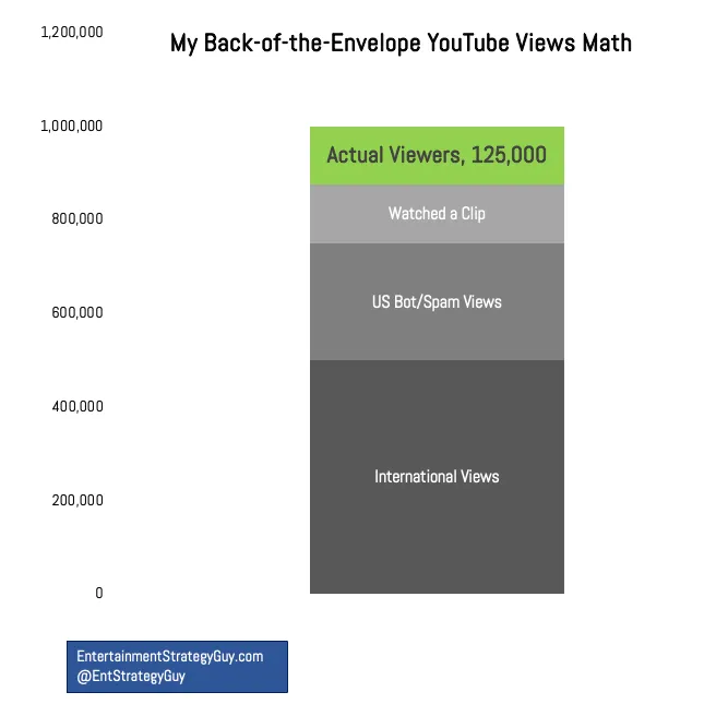
I worry that people equate YouTube views to streaming “views”3(also called CVEs, or “Completed View Estimates”, as Netflix and some datecdotes from the streamers use, taking the total hours viewed and dividing it by runtime) when they couldn’t be more different. Or worse, they assume that 46 million Americans (emphasis on “Americans”) mostly watched the whole thing, equating it to Nielsen’s average minute audience, which it most emphatically is not.
If those 46 million views translated into customers watching all three hours of Trump’s Joe Rogan interview, that’d be 138 million hours, or the second most popular single show on streaming all year by a wide, wide margin. (Behind Bridgerton!) But it’s not even close to those numbers for a few reasons…
YouTube “views” are vague and don’t tell you how long someone watched something.
YouTube has a spam/bot problem.
Nielsen’s Top Ten charts just show American viewership; YouTube stats are global.
And that last point truly grinds his (and my) gears:
This is probably my biggest gripe with people citing YouTube views; 75% of the time, they’re making a point about America, American media, or American viewers, but they’re citing global data. (Writers, columnists and analysts do this all the time; I’ve literally seen it three times this week.) That’s not apples-to-apples. Now, Joe Rogan knows his foreign viewership numbers, but we don’t. There’s no way every one of those 46 million views came from the US. It might be as high as half of them!
 He then devotes a lot of needed attention to the data that is being spun from Rogan and those quick to anoint him. He notes with authority that every million views translates to between one-sixth and one-eighth the size of its actual, engaged domestic audience. Using threshold metrics which both advertisers and programmers have applied to content and commercials for decades, he brings down the theoretical 138 million hours to a significant but hardly earth-shattering level:
Comparing that to streaming, 12 to 23 million hours is good, but not one of the twenty-five biggest debut shows this year. Is it still big and influential? Absolutely yes! Did it single-handedly decide the election? That assertion doesn’t make sense to me.
And besides, as he further observes, even in the context of traditional popularity metrics, politics, like everything else, is at best reaching a plurality–but nothing even close to a majority, And for a change, he relies on clear, concise bullet points rather than busy line graphs to illustrate his thesis: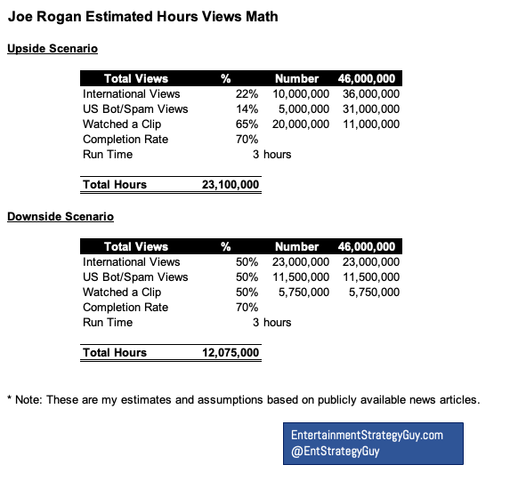
Let’s recap this year’s political TV show ratings (all according to Nielsen):
- 50 million people tuned in to the Biden-Trump debate.
- 24 million people tuned in to Biden’s post-debate press conference.
- 19 million people watched the news after Trump’s assassination attempt.
- 28 million people watched Trump’s convention speech.
- 28 million people watched Harris’ convention speech.
- 29 million people watched Biden drop out of the race.
- 67 million people watched the Trump-Harris debate.
Triangulating these numbers, probably 60 million people (30 million Democrats and 30 million Republicans) are really interested in politics, at least watching it on TV. (Most of these numbers include streaming.) I already know that some people are going to immediately rebut me, arguing “Well, everyone I know (or follow on social media) is into politics,” but even Nielsen reported that the election night coverage only had 22% market share; nearly 80% of TV viewers were watching something else.2
And it’s in his opening section’s closing that he shines a particularly bright and necessary light on exactly how much all of this really mattered to those who supposedly were impacted so dramatically:
Big coverage of news events influences how decision-makers—from campaign managers to media executives—make decisions. Too many people saw the Rogan YouTube views and drew strong, definitive conclusions from it. If you want to make better decisions, you need an accurate view of ratings, and this media coverage and analysis and punditry didn’t provide it.
 Rogan’s audience, both his regulars and those who may have come specifically for Trump, had already been exposed to quite a bit of messaging over a far longer period of time than just those fateful three hours. The most rabid followers have been in those worlds for at least a decade. And the messaging has been consistent–something that a broken campaign with uninspiring candidates couldn’t even close to making a claim for.
And this very clean, very nuanced narrative pretty much tells you why that’s the case.
Chef’s KISS, ESG. Keep up the great work.
Until next time…