They’ve lost their national accredidation. They’ve been accused of voluntarily watering down the quality of their product. They currently measure only a fraction of screens with a sample size approximately one tenth of one percent that of their largest rival. They lost one of their top executives to a highly significant client now determined to find viable alternatives to measuring the billions of dollars of media value they represent. Another is publicly embracing one of those fledgling competitors as a preferred currency for measuring their panoply of products.
So what does Nielsen do this morning to combat an onslaught of negative press perhaps only eclipsed by Facebook or, perhaps, Jon Gruden?
This:
Leblanguage has no words for the unmitigated gall of this pronouncement.
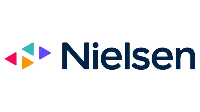
As Deadline reported this morning via a Nielsen mouthpiece, “the revamped brand signals the transformation of its culture and a redefined strategy focused solely on the global future of media. Nielsen’s new look and feel represents a commitment to innovation and the company’s role and purpose of powering a better media future for all people.”

Additionally blather from Jamie Moldafsky, Cheif Marketing and Communications Officer: “The rebranding marks a new Nielsen both inside the company and out, with a strategy hyper-focused on the global audience and the changing media environment. Nielsen’s core values of inclusion, courage and growth, along with its clear strategy, will power the company’s transformation as we partner with the industry and our clients to help them better understand how evolving audiences consume media and find content.”
I am continually dumbfounded at how so many public entities–media companies, politicians, athletes, you name it–believe that lipstick on a pig creates enough of a distraction that an observer will forget it’s still a pig. The very fact that at the beginning of a highly anticpated New York Advertising Week rather than unveil any new details on the supposed impending upgrades to their wholly antiquated measurement process suggests only one of two conclusions. Either Donald Trump is a paid consultant, or Nielsen has absolutely nothing new to share with an ever impatient media world at the outset of the eight most active weeks of media placement of the year. Perhaps both.
The release concludes with an artistic explanation of the new logo’s raison d’etre–yes, those four triangles are arranged in such a way where the negative space between them is indeed the letter N. In the late 70s NBC, already in serious decline as a broadcast network, also introduced a restyled N, losing the classic peacock iconography that it had had since the late 50s. That N will forever be associated with one of its weakest creative eras and lowest competitive standing in its history. We got Supertrain and Pink Lady and Jeff.
As it turned out, they had also “unknowingly” ripped off a very similar logo from Nebraska Educational TV, who successfully filed a copyright infringement suit that resulted in NBC altering it and bringing back the peacock in the early 80s–concurrent with the introduction of the “must see TV” series that brought it back to prominence.
And therein may be a lesson for the Nielsen of today–if you truly want to restore your image, try producing product worthy of attention rather than wag the dog with a fancy rebranding. Nielsen’s “problem” is not how people see its logo, it’s how people see its progress. It’s how they continue to defend 20th century technology to 21st century consumption.

Dogs and pigs, even lipstick-enhanced, are just animals who shit a lot. It may be time for Nielsen to pick up after itself.
Until next time…
